Porch House Kitchen + Sunroom // A Reveal 2-Years in the Making
THE PORCH HOUSE
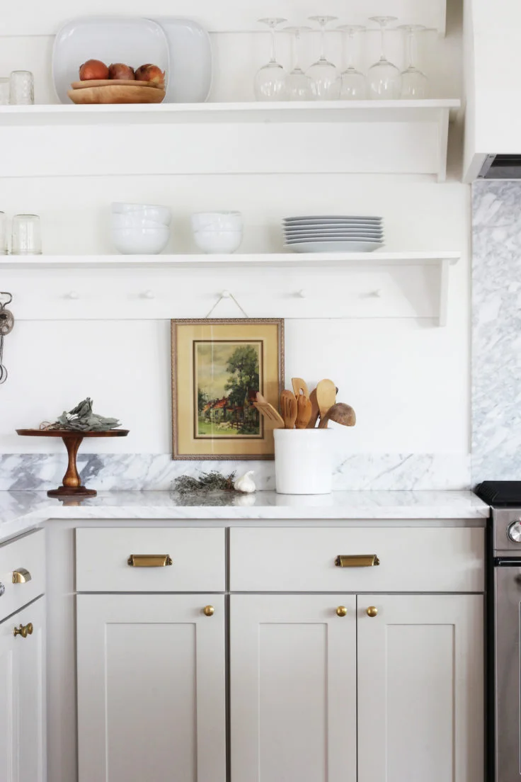
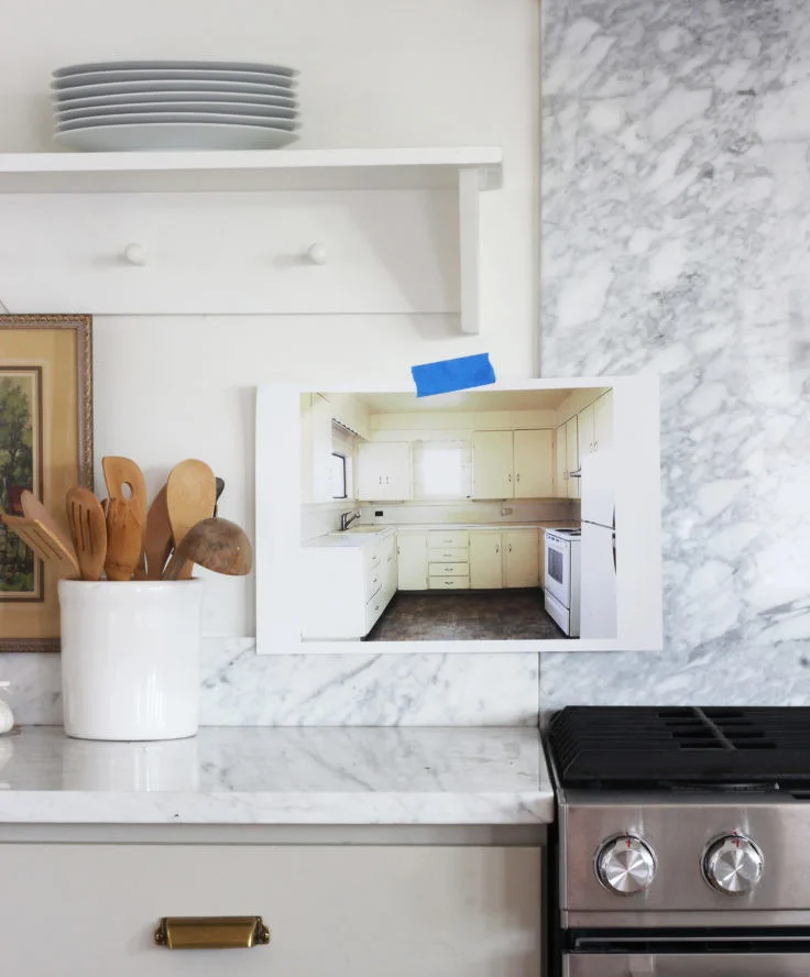
This month marks two years since we wrapped our pilot for HGTV (Master Plan eventually aired in February 2018). And in all the time since, I’ve never actually revealed the kitchen and sunroom. Sure I’ve shared glimpses - singular photos of marble, white oak, brass, and the softest green cabinets - but not the full kitchen and sunroom in one spot with resources and stories and all that jazz.
So that’s what we’re doing today.
our Porch House kitchen renovation // all sources are at the bottom of this post
before to after in 16 days…
Because this renovation was filmed for our pilot, we were on HGTV’s schedule. That meant renovating this kitchen and sunroom (plus the living room, bedroom and 1/2 the exterior) in 16 days. The experience was a whirlwind. And exhausting (I was 20+ weeks pregnant at the time). And totally thrilling!
After filming wrapped, we were asked by HGTV not to share finished photos of the space while we waited to see if our pilot would air. By the time it did air in February 2018, we had finished the rest of the renovation, sold the house (to Garrett’s parents), and mentally moved on from the Porch House. I’ve thought about reshooting the space and doing a proper blog reveal a hundred times, but we always seem to have more pressing projects to get done. And with 2-years already into the making of this post, I figured it was time to share what I have. I hope you love this space as much as we do!
Floor Plan Changes
The Porch House’s kitchen and sunroom saw big changes to their floors plans during the whirlwind construction. The main change, of course, was the removal of the wall between the rooms. But we also rearranged the kitchen, added a big island with seating, and gave the pantry a dedicated spot. Here are what those changes looked like in plan view.
the heart of the home
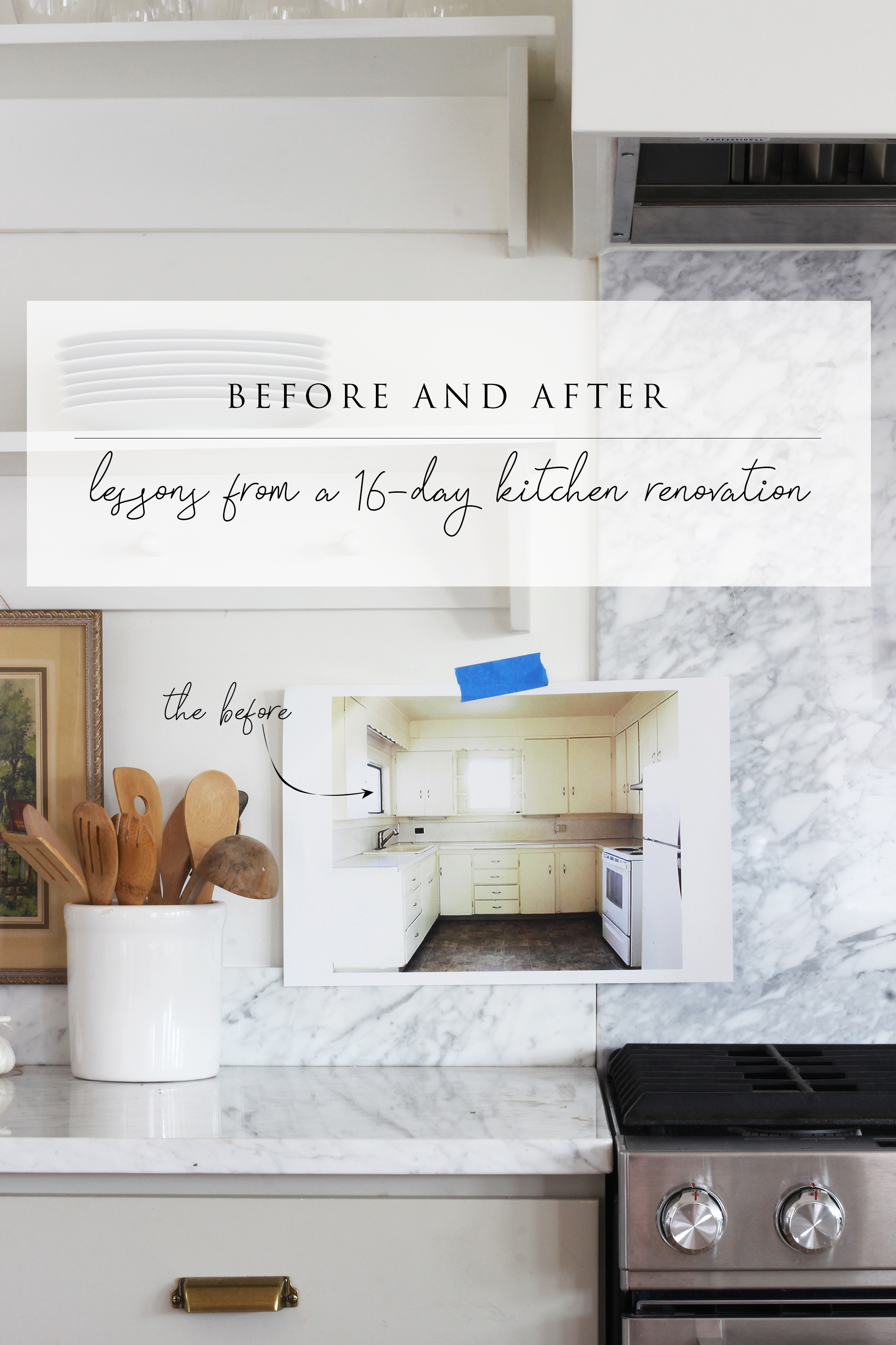
The original kitchen was small and old but not exactly original to the 1900 Porch House. It had dropped ceilings, laminate counters, and the add-on tacked onto the side of it. The whole thing was awkward.
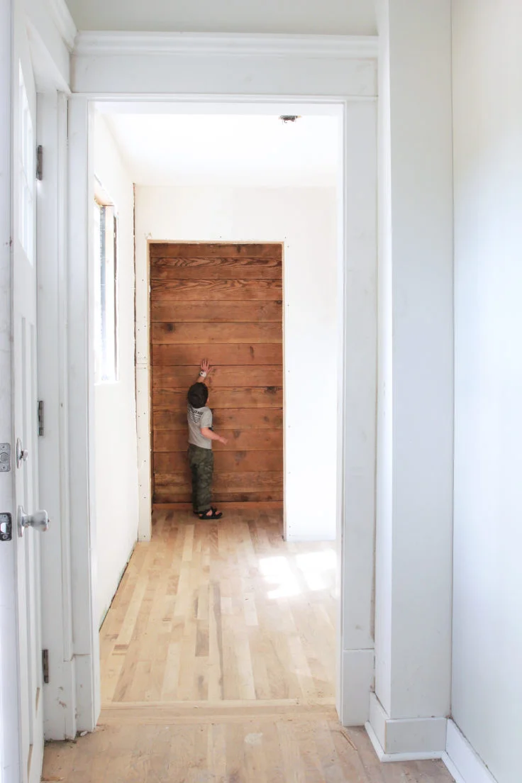
During one big day of demo, Garrett and 3rd Gen Construction - the local company we hired to help us during the pilot - took down the wall between the kitchen and the add-on. I was pregnant so got to sit out of this one. They also removed the dropped ceilings and found another foot of head room.
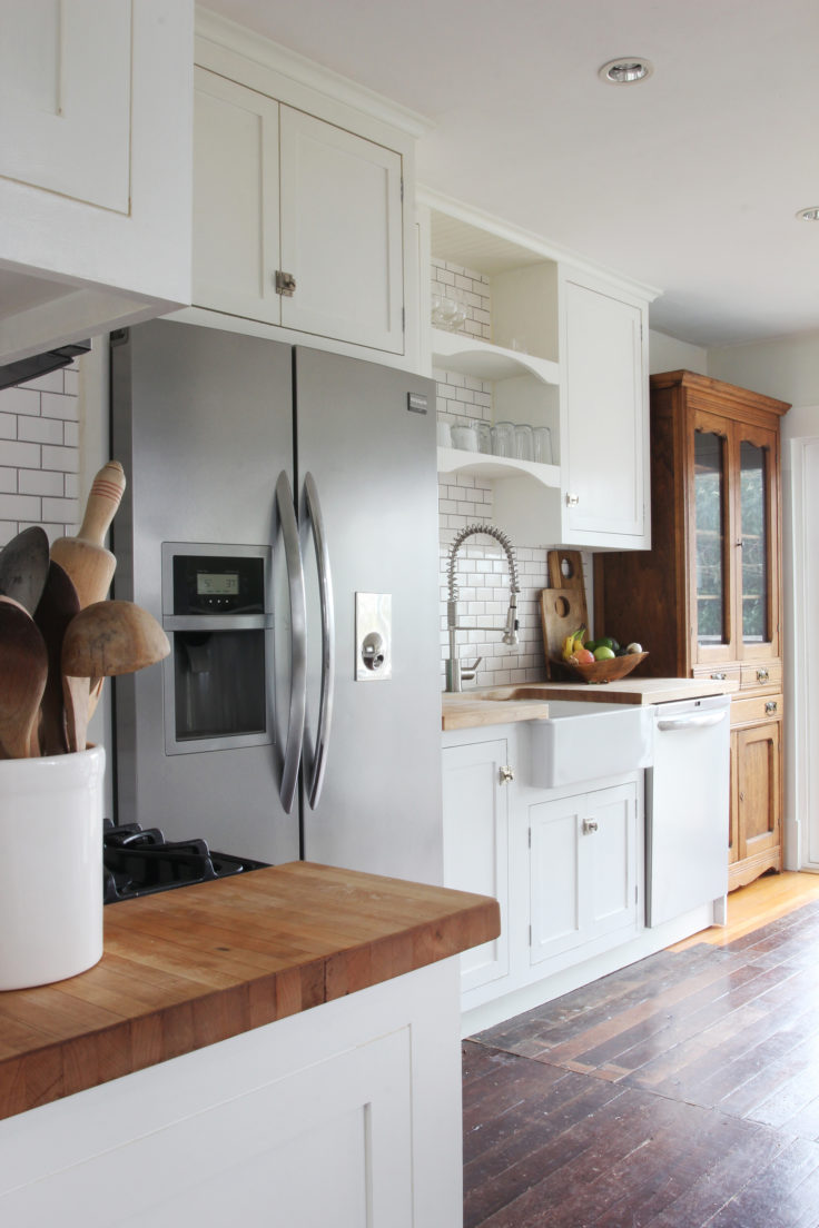
After 16 days of construction (including lots of help from family and friends, too), we filmed the reveal for Master Plan. Looking at these photos now, I wish I had staged the kitchen differently - I only left myself a couple of exhausted hours to complete the task - but all-in-all the space turned out great. Especially when you consider the timeline.
I think my favorite thing in this kitchen is the white oak, end-grain butcher block. It’s stunning! Everyone who walks in the door comments on it.
Pantry corner
We created a pantry nook under the stairs and opposite the main hub of the kitchen. I think this space used to be an eat-in area, but we added seating to the island so no one missed it. The old frilly molding detail is really something, right?!
This space was tricky to design because of the sloping stairs. I had originally planned all tall-cabinets so it would feel like a pantry wall, but the stairs made that impossible. So we mixed in some lower cabinets. We also found a large structural beam above the dropped ceiling, which was a surprise. The beam ran over our fridge location causing a little heartache with the cabinet. In the end, 3rd Gen Construction cased out the beam to make it feel intentional and customized the fridge cabinet. I love this little nook!
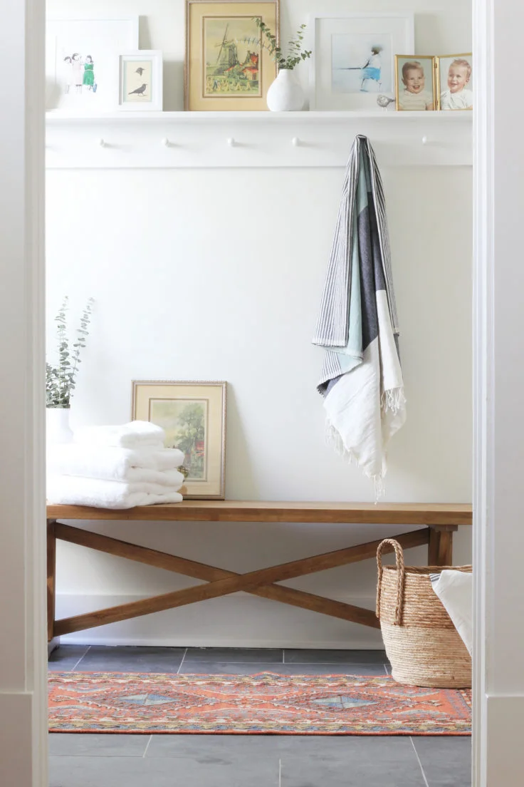
We continued the shaker peg shelf in this corner and I always imagined it topped with glass jars of pantry staples. Garrett built the shelves and you can read more about our process of installing shaker pegs here:
the sunroom (aka the awkward add-on)
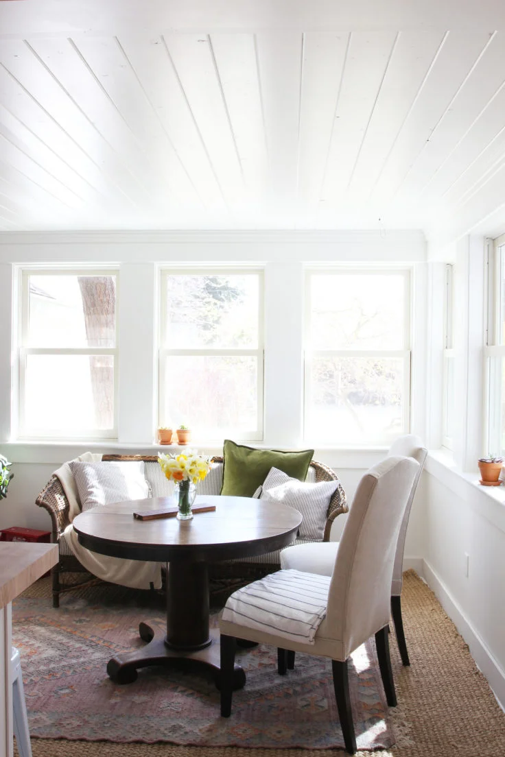
The sunroom underwent the biggest transformation in the Porch House. This tacked-on space went from closed-off and smelly (oh. so. smelly!) to my favorite room in the house. It’s light and bright and the gathering spot of the Porch House. Here’s a look at where we started and again after demo.
For as much work as we did during demo, even more effort was put into this space during the pilot. We added 5 double-hung windows (which we picked up at a salvage shop in Seattle), and 3rd Gen Construction’s talented carpenter trimmed them out with the most beautiful, historic-looking molding. We also planked the 7’-ceiling, covering all the sins of the previous renovation and making this short space feel more intentional. This sunroom feels like it’s always been here.
Confessions from an HGTV Pilot…
Between you and me, not everything was 100% finished on the day we filmed our pilot’s reveal. As our film crew liked to say, “the camera won’t see it”. And with only 16 days to renovate this space, there was a fair bit we didn’t want seen. Such as…
There was no heat in this space. We added a heat pump later and one head went in the ceiling of the kitchen (I know a less conspicuous spot would have been ideal but this location functioned best).
None of the appliances worked. The fridge wasn’t able to slide back all the way because the cabinet was too short (lesson learned: never build an appliance cabinet without the appliance on site). We fixed the cabinet and hooked up all the Kitchenaid appliances, both electric and gas.
The butcher block and floors were completely unfinished.
Paint is missing on some toe kicks
The island side panels, toe kick, and electrical outlets weren’t installed
The lighting was swapped out for more budget-friendly versions
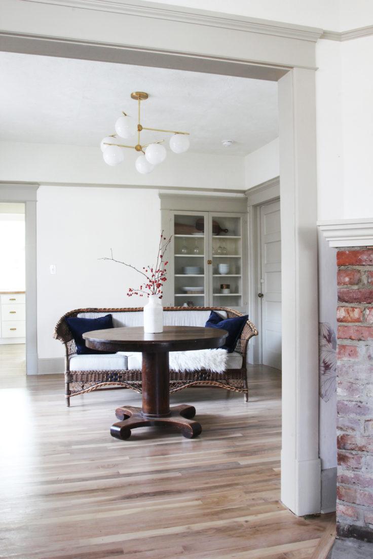
Adjacent spaces (like the mudroom and dining room) were completely untouched so we hung plastic sheets in the doorways to make sure they wouldn’t appear on film.
Of course we fixed all of these things before the house was sold. And thankfully I got to re-stage the kitchen. Here’s what the space looked like on the day we handed the keys to Garrett’s parents. And for those of you wondering, no, we didn’t know they wanted to buy the house until the renovation was almost complete.
finishes & resources
All the sources for this renovation are below. The wood floors and butcher block came from my brother-in-law’s company, Hardwood Industries, and the appliances came from Shaw’s in Ellensburg (they gave us amazing deals!). Elkay provided the sink, faucet, and pot-filler. Everything else was bought by your’s truly.
Sources: 1. C2 Vex on cabinets / 2. BM Simply White on walls and island / 3. faucet / 4. marble countertops / 5. butcher block (+ hardwood floors) / 6. shaker pegs (on shelves) / 7. vase / 8. pulls + knobs + latch / 9. cake platter (similar) / 10. sunroom rug / 11. range / 12. dishwasher / 13. fridge / 14. pot filler / 15. sconce / 16. pendant (in old brass) / 17. budget sconce / 18. budget pendant / 19. utensil crock
I also wanted to share some side-by-side ‘before and after’s’ but this post is already long so I’ll get those together for Thursday. In the meantime we’d love to hear what you think of this space! Leave us a comment or question below.


