How we Built a Shelf below our Upper Cabinets (+ other layouts we considered)
THE FARMHOUSE
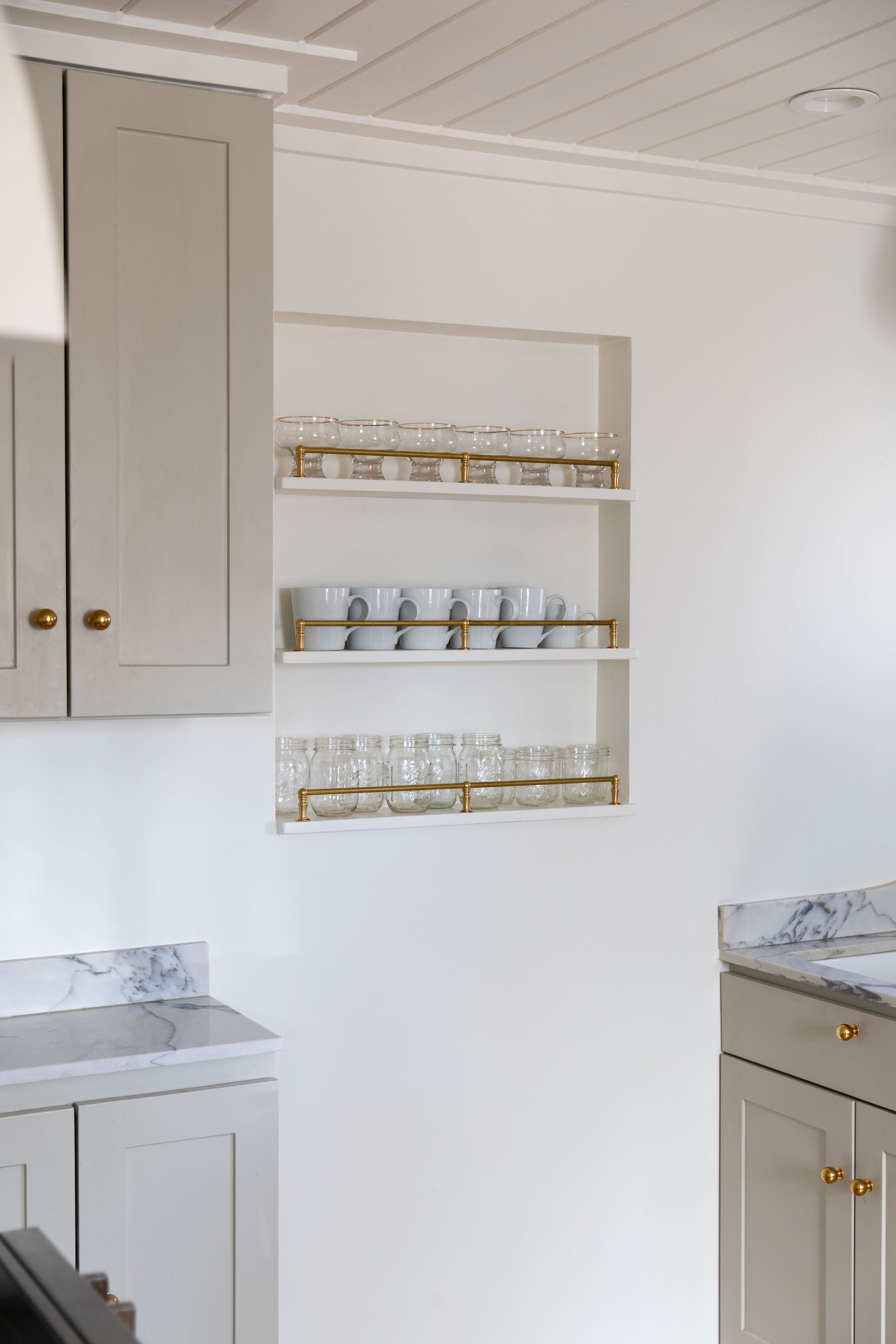
The Farmhouse kitchen came with taller ceilings (10'3"), which are airy and beautiful, but had us stumped when it came to arranging the upper cabinets during the remodel. The gist of the issue: we wanted to reuse our existing upper cabinets, but we wanted a more-custom cabinets-to-the-ceiling look. After noodling on the issue for months, we came up with 3 really good design options and are sharing them today, including how we ultimately built the adorable shelf under the upper cabinets in our final design. Hopefully this will be a helpful starting point for anyone renovating a kitchen with taller ceilings and facing a similar issue.
Those images are from our kitchen reveal. Let’s back up and walk through the existing cabinets we were working with, how we designed and built the shelf, and the other upper cabinet layouts we considered.
reusing our existing standard height cabinets
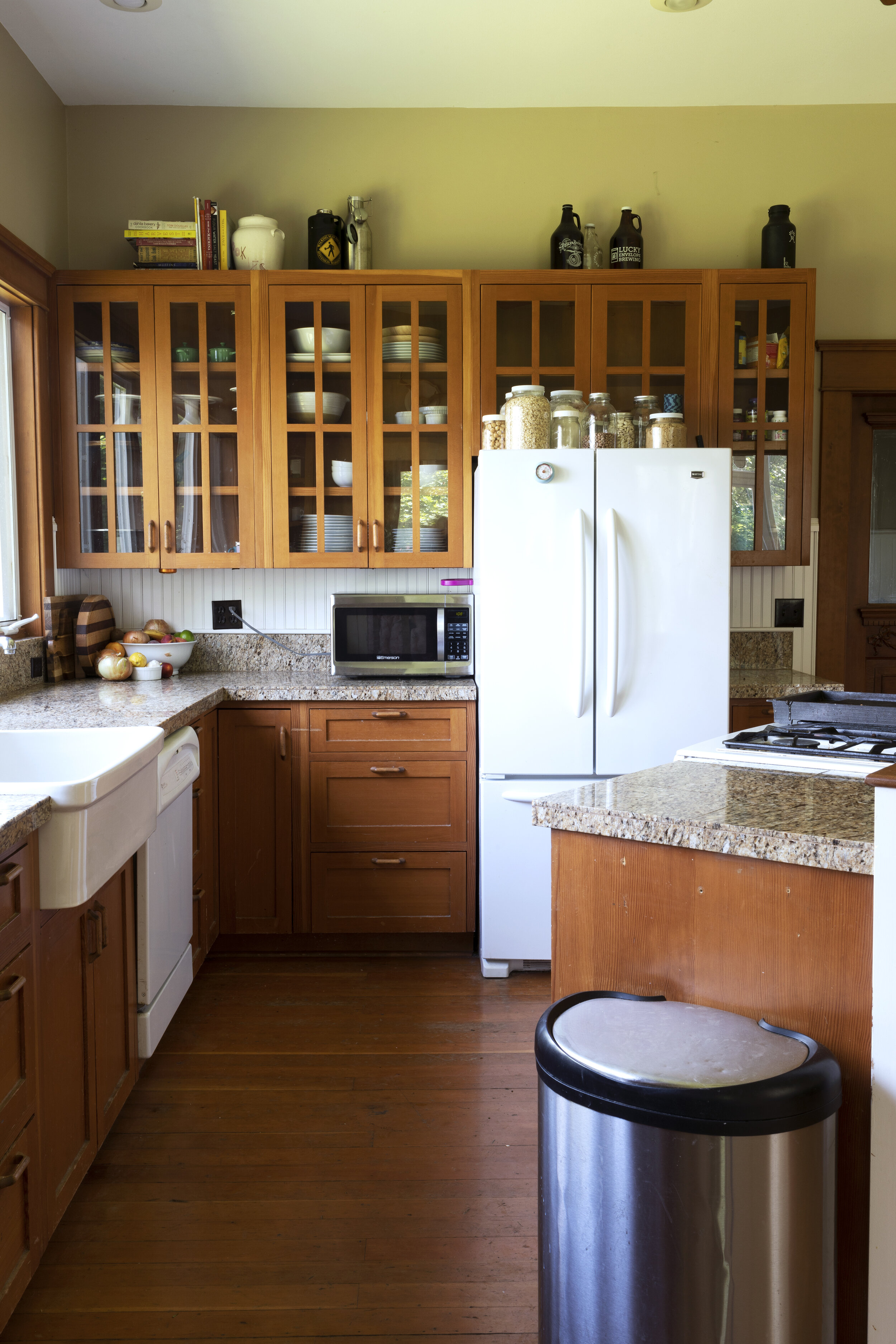
Our kitchen came with nice fir cabinetry, courtesy of a previous homeowner’s renovation. And thankfully they were still in good shape. So we could rearrange them rather than replace them. Using the existing cabinets would save money, energy, time, and natural resources.
But…the VG fir cabinets didn’t exactly fit the style of our 1912 Farmhouse kitchen. Our home is full of original, unpainted old-growth fir moldings and the new wood stood out like a sore thumb. So we felt like this was a great opportunity to lighten things up with paint. We used our go-to white color.
We also wanted to bring the cabinets to the ceiling for a more-custom finished look. And since our kitchen design already called for a lot of open/glass storage, we planned to swap out the glass in the upper cabinet doors for plywood panels. Here’s what our upper kitchen cabinets looked like before we started remodeling...
It all felt very 90s! The standard height floating upper cabinets did nothing to complement the taller ceilings (10'3") in this kitchen. Here are the three options we considered for rearranging the upper cabinets to create a more-thoughtful and custom-looking kitchen.
option 1 // bring cabinets to the ceiling
The first layout we considered for the upper cabinets was leaving the upper cabinet boxes in place and adding higher cabinets above them. That would give us the built-in cabinetry feeling we love. (You could alternatively build a soffit to the ceiling.)
The negative with this plan is that those upper cabinets would likely be custom and expensive.
Option 2 // run cabinets countertop to ceiling
The second layout we considered at the Farmhouse was stacking the two same-sized cabinets on top of each other to bring the cabinets from the counter to the ceiling. Our’s cabinets just happened to be perfectly sized so that the top of the cabinets would reach the ceiling height. Serendipity? Maybe. This layout would certainly show-off the height of the kitchen and let the range hood stand alone as a feature.
This layout felt like a great idea in practice, but it looked a bit odd in this space. One thing to note is that having the bottom of the upper cabinets at counter height would take away valuable countertop space. Not a huge deal in larger kitchens, but something worth consideration.
option 3 // raise the cabinets to the ceiling and add a shelf below
When we proposed the first two layout options in a post last Spring, my friend Ashley left us a comment that changed everything. She suggested we push the existing cabinets to the ceiling and add a shelf below them. Honestly, we hadn’t even considered this and it was totally brilliant (plus less expensive and less work, too!).
We played around with the height of the upper cabinets, but ultimately hung them about 12” below the ceiling so normal-height humans could actually use the bottom two shelves of the cabinets. As a bonus, the small soffit space above the cabinets came in handy for ducting our hood vent to the exterior wall.
Building a shelf below the upper cabinets
Below the cabinets, we set to work designing a shelf that would fit our modern-traditional-country-Farmhouse kitchen. We wanted something that would read “old hutch” rather than “modern open shelf” and decided to use large, curved brackets that would connect the shelves to the cabinets. Garrett cut one of the brackets out of salvaged 3/4” solid fir and then traced, cut, and sanded the other three brackets. BTW, there will be a shelf on either side of the range hood.
Because we live in an old home and nothing is square, level, or plumb, we opted to build these shelves in place. Garrett started by attaching the brackets to the bottom of the upper cabinets with screws. He then spanned the brackets with a solid-wood shelf, which he screwed and glued into the brackets. The back of the shelf is held to the wall with glue and caulk. That's it!
Here are the dimensions of our shelf:
Height above counter: 19"
Depth of shelf: 10.5”
Shelf to bottom of cabinet: 12"
I’m really happy with how the proportions turned out visually!
We’re not 100% done with the shelf yet, but we’re really happy we went with this layout option. Not only is it a great look, but it was way easier and less-expensive than adding a bank of cabinets at the ceiling (like option 1). But mostly, it’s a great look.
Designing the soffit
We went back on forth on how to finish the soffit out, and finally paneled it to blend in with the walls. But now that everything’s coming together, we’re questioning that choice. A smooth face like the cabinets would give more of a built-in or vintage-hutch-on-the-wall feel. So we will likely make that change.
At this point, it still takes a little imagination to see what this wall will look like when we’re done. But both Garrett and I are really happy with the direction!
Thank goodness for friends with great ideas!
Garrett and I are making a mad dash to finish this dream kitchen of our's before we welcome 24 guests for Thanksgiving next week. Eek! Wish. us. luck! You can catch all the craziness and behind-the-scenes action in our Instagram Stories!


