Porch House Kitchen // Before + Inspiration
THE PORCH HOUSE It's been awhile since I talked about the Porch House here on the blog, and it's high time we get back to it. As a quick reminder, Garrett and I bought this 1900 home early this year as a flip project. We quickly got down to the business of renovating, tackling the kitchen, sunroom, living room, master bedroom, and exterior, which were filmed by HGTV as a pilot for a new show, 'Rehab Crazy' (more about that experience here and here). The pilot is still in post-production and I don't want to give away too much until we hear if it will air or not, so we won't be getting around to the reveals for a little bit. But that won't stop me from sharing the kitchen design and inspiration today.
The kitchen at the Porch House is one of my favorite rooms that we've ever renovated. I'm pretty sure I say that about every kitchen we do, but this project was definitely special. Not only did we complete the transformation in 16 days (a timeline required by our production company), but we had some great help in the form of talented contractors, learned some new DIY skills, and put in a lot of my dream kitchen finishes. It's a good one guys, and I can't wait to show you the finished space!
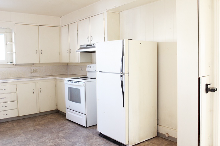
But let's start at the beginning. Here's what the kitchen looked like before we got out the sledge hammer.
Not awful, but not exactly a chef's dream. As with most century-old homes, the Porch House kitchen had been previously renovated. The ceilings were dropped to 8' (the rest of the original main floor has 9'), the moldings were stripped, and a back 'storage' room was added on behind the kitchen. The general affect was a blah kitchen that was completely closed off, dark, and anything but inspiring.
Right away we knew this would be a gut remodel because there really wasn't anything to save. And that was okay in my book, because kitchen renovations are my favorite. Plus we intended to flip this property, and kitchens sell homes, so we needed an amazing kitchen.
I will say that for all it's negatives, this kitchen did have one thing going for itself: it's size. For an old house, it was pretty spacious, and right away I saw the potential to enlarge it even more by opening it up to the adjacent storage room (aka future sunroom). The end result would be a bright and family-friendly kitchen/living space, which would surely be the heart of this home.
Modernizing the kitchen was also a top priority, which would entail new electrical, lighting, gas piping, plumbing, appliances, etc. But modern amenities didn't mean I wanted a modern-feeling space; quite the opposite in fact. I'm a firm believer that renovations should fit the vintage and style of a home, so making this kitchen feel like it belonged inside a 1900 farmhouse (while still having all the luxuries of a 2017 kitchen) was the most important goal of the entire renovation. Another design goal was to bring back some of the 'old house charm' found elsewhere in the Porch House, mainly replicating the original chunky moldings and the 9' ceilings.
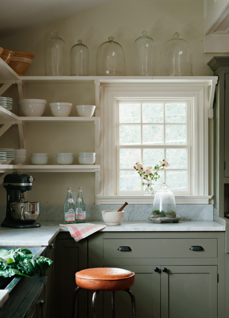
If I had to wrap up the kitchen design in a few words, I'd call it a subtle, current, and welcoming space. This room is all about craft, simplicity, and understated elegance, much like these inspiration images:
clockwise from top left: 1 / 2 / 3 / 4
Pretty, right? Everything feels simple, muted, and vintage, but also well-crafted, fresh, and clean. I decided pretty early on in the design process to nix tiles from this kitchen, opting instead for a marble slab backsplash behind the range and a short 4" marble backsplash everywhere else. There were two reasons for this. First, I wanted to keep the shine and gloss to a minimum so that the crafted elements would stand out. And secondly, with only 16 days to complete the renovation for the cameras, setting and grouting tiles just wasn't in the schedule.
Another major element of the kitchen design, was the use of natural materials. Not only do I always gravitate towards natural materials, but they also lend an authentic and character-rich feel to old spaces that the man-made alternatives just can't compete with. Thus I relied heavily on marble, wood, and brass.
This is what all of that looks like:
I put this board together even before we started demo, and while a couple things changed during the course of construction, it still holds pretty true to the end product. Goodness, I'm dying to show you the 'after' photos! Soon enough. In the meantime, I'll be sharing more about the butcher block countertop and the appliances we picked (with a few sneak peeks of the finished space thrown in)!
xoxo
-Cathy


